Redesigned main window
The main window was redesigned: 22 px rows, the filter in the path row, a quieter status bar and tabs flush with the panes. Panes without the keyboard focus are dimmed instead of the focused one having a border. New settings choose outline or system file icons (
OutlineFileIcons), bold folder names (BoldDirectoryNames) and the date formats (StatusBarDateTimeFormat, FileList.DateFormat).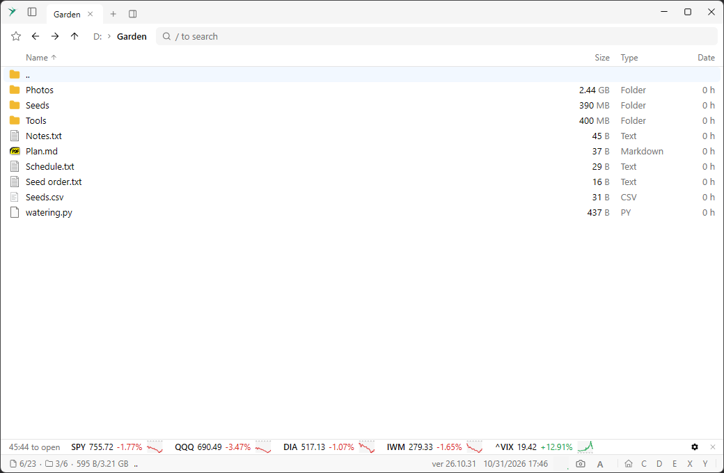
Quick access sidebar
The icon after the app icon in the caption, or
Ctrl + B, shows a sidebar with the locations, places and favorites and a filter on top. Selecting an item opens it in the current pane. Drag its edge to resize it.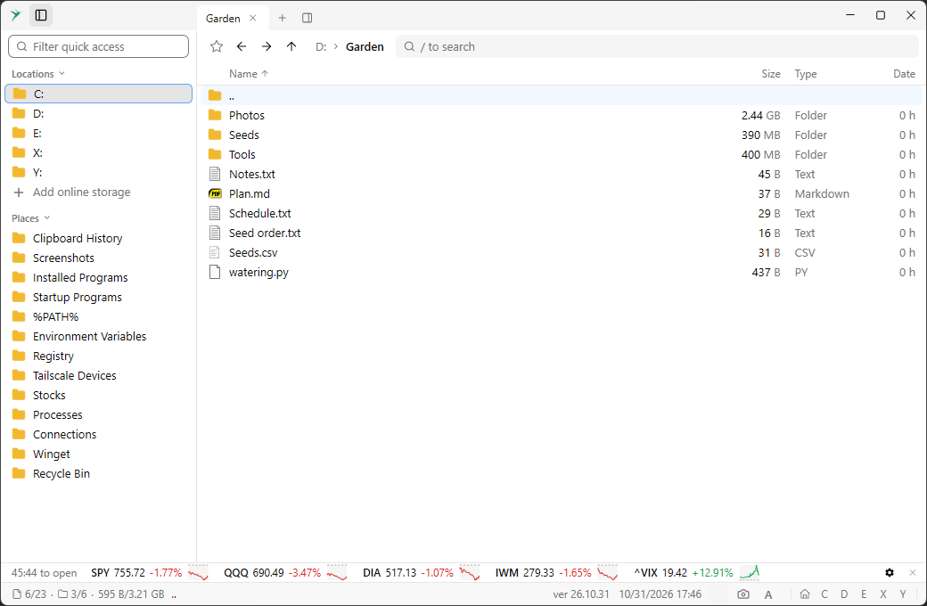
Preview panel
Space toggles a preview of the selected file below the list: a thumbnail and image information for pictures, the first lines for text and source files, and the metadata of an S3 object. It follows the selection, scrolls when needed and can be resized by dragging.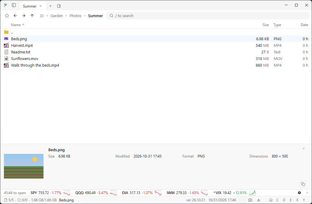
UI font size
Ctrl + +, Ctrl + - and Ctrl + 0 change the size of the text in the app, like in a browser. The UiFontSize setting keeps it.Split button and new panes
A button after the + in the tab bar splits the current pane right, left, up or down. A new tab or pane opens the home view with the focus in the filter.
Redesigned command palette
The command palette was redesigned: taller, with a more compact list and the row of lists centered. Matches are highlighted the same way in the palette and in the file list filter, also on selected rows.
Locations in the home view
The Drives section of the home view is now called Locations.
Screenshot window opens faster
The screenshot window shows up right after the desktop is captured, and thumbnails of the other windows are added as they are captured.